Purpose of the tool
Procedure
Settings
Interpretation guide
Forms of representation
Requirements
Tools
Examples
Terms
Formulas
-
Purpose of the tool
The bar chart is used to graphically represent the frequency of different categories. It answers the question of which categories occur most frequently. In addition, the bar chart can be used to represent the value of a measured variable for each category. This allows for a quick and clear comparison between groups.
The bar chart is particularly suitable for:
- categorical characteristics (e.g., machine, product, shift)
- Means, sums, or frequencies per category
- simple, visual comparisons without assumptions about distributions
-
Example: tomato sauce
The sales figures for various tomato sauce products are recorded in the sales department. The number of units sold for the following varieties is examined:
- Classic tomato sauce
- Tomato sauce with herbs
- Hot tomato sauce
A bar chart is used for the evaluation, which shows the frequency of the products sold. The aim is to identify which tomato sauce variant is purchased most frequently.
Explanations of the results:
The bar chart shows a bar for each tomato sauce variety, the height of which corresponds to the respective sales volume.
Explanations of the graph:
It can be seen that the tomato sauce with herbs is the most frequently sold. This is followed by the spicy tomato sauce and then the classic tomato sauce.
-
Procedure
Preparation
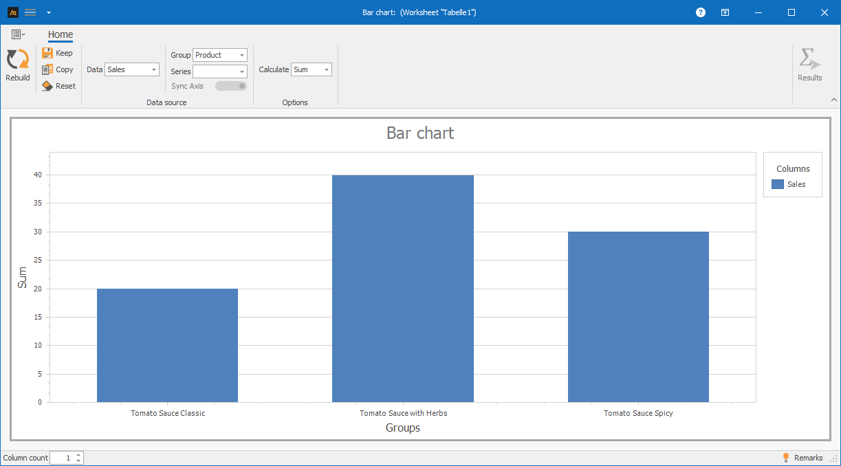
- Define the categories to be compared (e.g., classic tomato sauce, herb sauce, spicy sauce)
- Defining the frequency to be displayed (e.g., number of units sold)
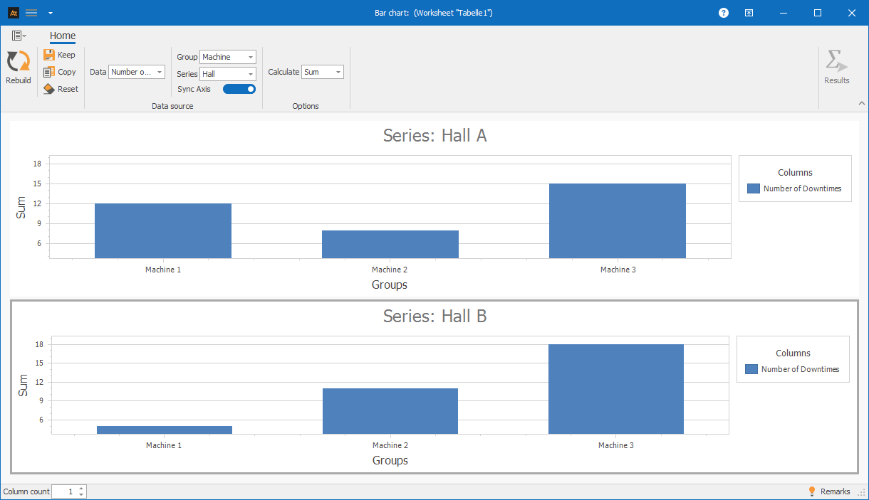
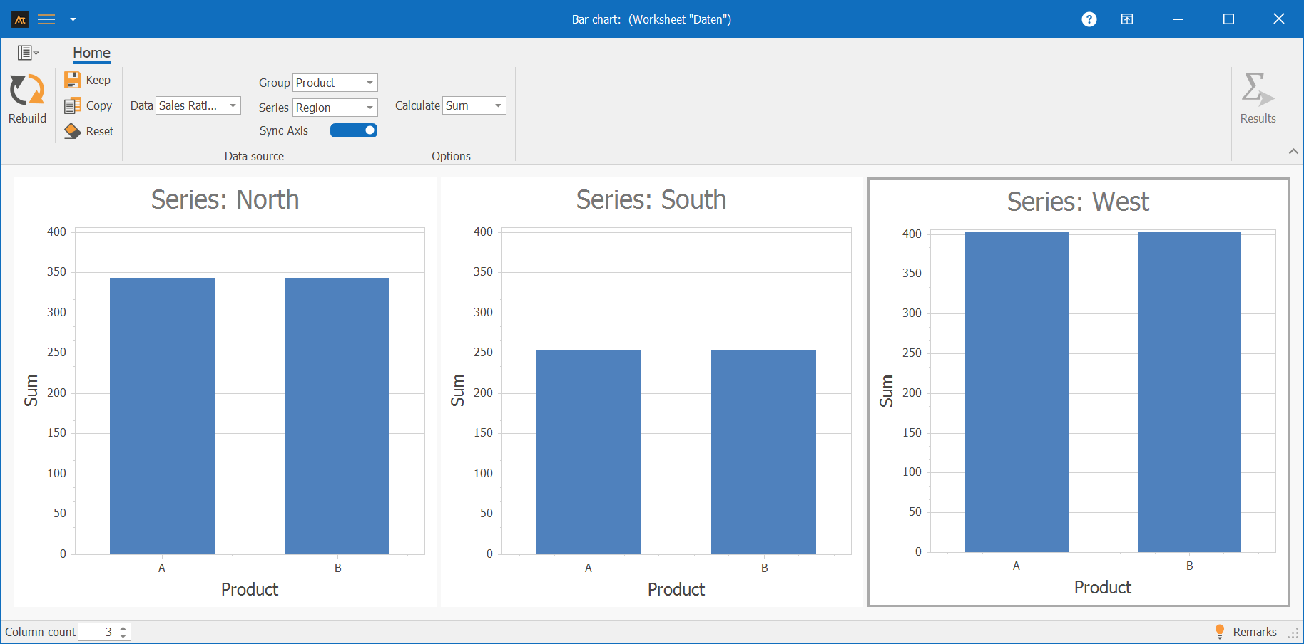
Use in AlphadiTab
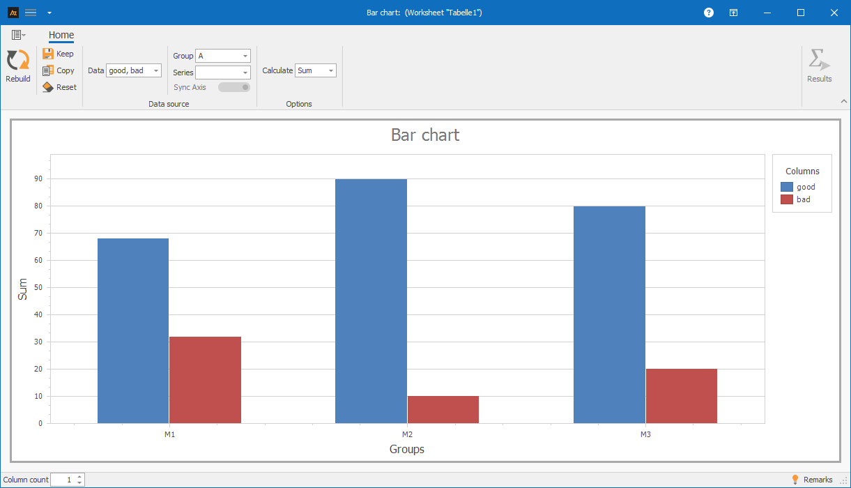
- In the Measure phase, select the bar chart tool.
- For data, select the “Sales” column.
- Select the “Product” column for the group.
- Select the “Sum” calculation method.
- Generate the chart using the “Create new” button.
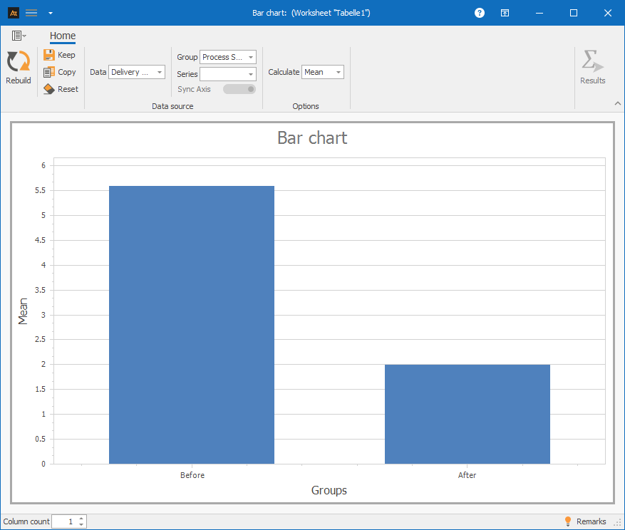
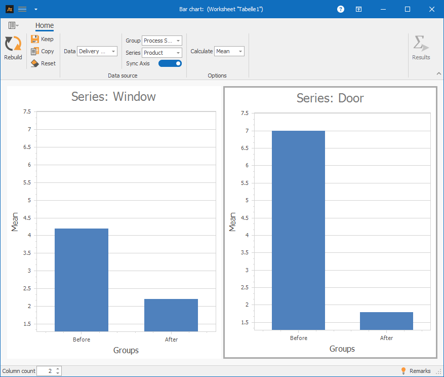
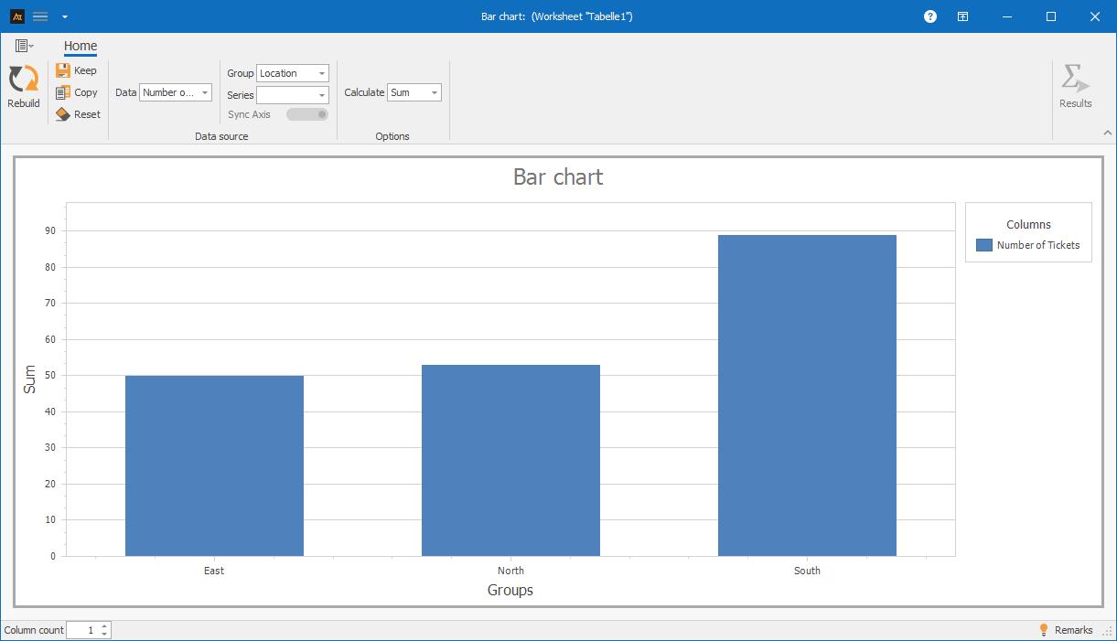
Interpretation
- Comparison of bar heights
- Identification of the highest and lowest bars
-
Interpretation guide
General considerations
- How high are the bars?
- Which category has the highest value?
- Which category has the lowest value?
- Are there any noticeable differences between the bar heights?
- Are there any categories that stand out (very high/very low)?
For known specifications
- Is the specification fulfilled?
-
forms of representation
Various display formats are available for bar charts. The display in the chart changes depending on whether one or more data series and additional groups or series are selected. Data can thus be visualized as individual bars, grouped, or broken down by series and compared with each other in a targeted manner. All of the following display formats are based on the same file, but differ in the selection of columns used. The respective procedure is described in the individual tiles.
A data series: Column A
Procedure:
Step 1: Under “Data,” select only column A.
Step 2: Under “Group,” select column D (Process Status).
One data series and group: Column A and Column D
Procedure:
Step 1: For Data, select only column A.
Step 2: For Group, select column D (Process Status).
A data series with group and series: Column A and columns D and E
Procedure:
Step 1: For Data, select only column A.
Step 2: For Group, select column D (Process Status).
Step 3: For Series, select column E (Product).
Multiple data series: Columns A-C
Procedure:
Step 1: Select columns A-C for data.
Multiple data series with group: Columns A-D
Procedure:
Step 1: Select columns A-C for data.
Step 2: Select column D (process status) for group.
Multiple data series with group and series: Columns A-E
Procedure:
Step 1: Select columns A-C for data.
Step 2: Select column D (process status) for group.
Step 3: Select column E (product) for series.
-
Requirements
At least one quantitative data series with at least one data point (countable or measurable data).
-
Tools
(When are others more suitable?)
If the shape, location, and dispersion of distributions are to be analyzed or compared → histogram or box plot
If temporal developments or changes over time are to be considered → time series chart
If correlations between two metric variables are to be examined → scatter plot
-
Examples
Development
Development of old vs. new recipe
A new recipe is being tested in development. The bar chart can be used to check whether the average viscosity of the new recipe is the same as that of the old one.
The bar chart shows the average viscosity of the old and new formulations.
The bar heights for the two categories, Old and New, are at a very similar level.
Based on the mean values shown, there is no clear difference in the average viscosity between the old and new formulations.
Quality assurance
Measuring the quality of test results
The test results for the manufactured parts are recorded in quality assurance. For each machine, it is documented whether a tested part meets the quality requirements (good part) or does not meet them (bad part).
The bar chart shows the number of good and bad parts for machines M1, M2, and M3. Machine M2 has the highest number of good parts and very few bad parts. In comparison, machine M1 has the highest number of bad parts. For machine M3, the proportion of defective parts lies between M1 and M2. This clearly shows that the machines differ in their quality performance, with M1 standing out.
Production
Check the frequency of downtime
Machine downtime is systematically recorded in production.
The frequency of downtime is documented for each machine. In addition, each machine is assigned to a production hall.
A bar chart is used to display the number of downtimes by machine and hall.
The aim is to identify which machines and halls experience particularly frequent downtime.
The bar chart shows the number of machine downtimes for each machine, separated by production hall. It can be seen that machine 3 in hall B has the highest number of downtimes. Machine 3 in hall A also shows an increased frequency of downtime compared to the other machines. Machines 1 and 2 in both halls have fewer downtimes overall, although the frequency of downtime differs between Hall A and Hall B. Based on the bar chart, it is therefore possible to determine which machines and in which hall downtimes occur particularly frequently. These machines and halls can be prioritized as focal points for further root cause analysis.
Service
Processing time for tickets by location
The IT service desk handles requests from multiple locations.
To get an overview of the workload, the number of tickets processed per location is evaluated.
A bar chart is used to display the number of tickets processed per location in order to highlight differences in ticket volume.
The bar chart shows the number of IT tickets processed at the East, North, and South locations.
The South location has the highest number of tickets processed.
The North and East locations are at a significantly lower and similar level.
This shows that the ticket volume differs between locations, with the South location having the highest workload.
Sales
Sales quota by region
In sales, sales opportunities are handled in several regions. Although the same products are offered, market conditions, customer types, and competitive intensity may differ.
A bar chart is used to examine whether the average sales rate differs between regions and products.
The bar chart shows the average sales ratio for products A and B, broken down by the North, South, and West regions.
In the West region, the sales rates for both products are significantly higher than in the other regions.
The North region has average sales rates, while the South region has the lowest overall sales rates.
Within each region, the sales rates for products A and B differ only slightly.
Logistics
Delivery time to logistics center
In logistics, customer orders are processed across multiple logistics centers.
To get an overview of how orders are distributed across the logistics centers, we look at how many deliveries each logistics center has handled.
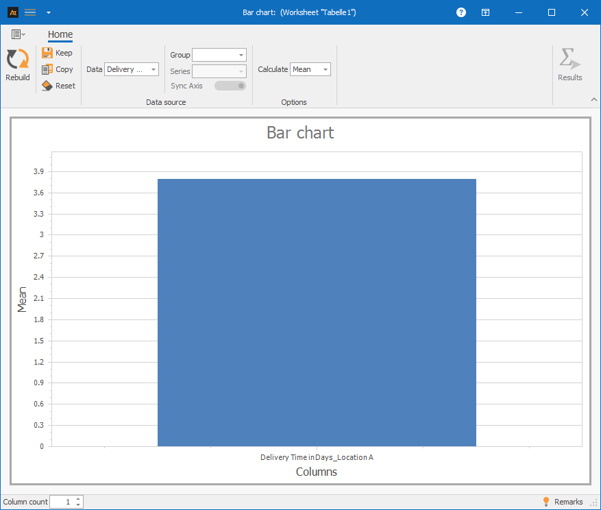
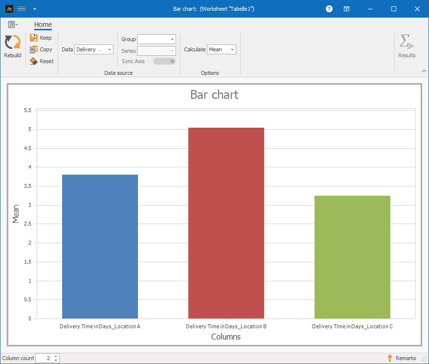
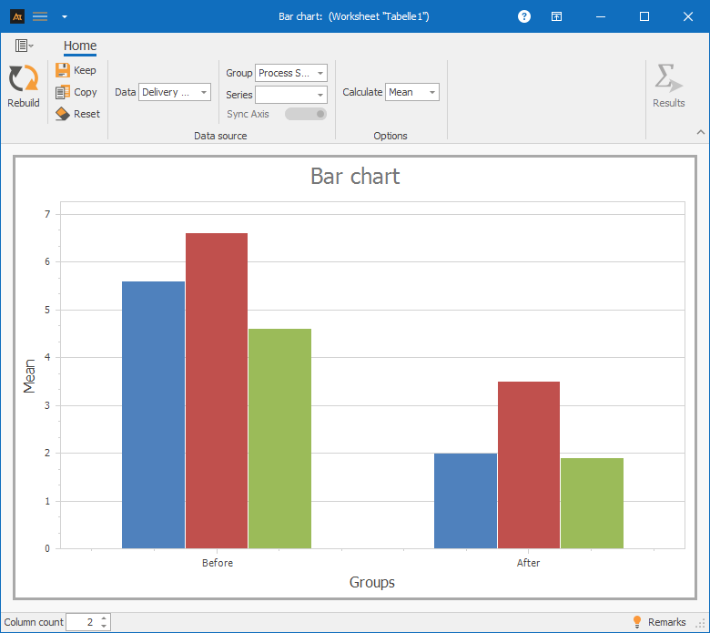
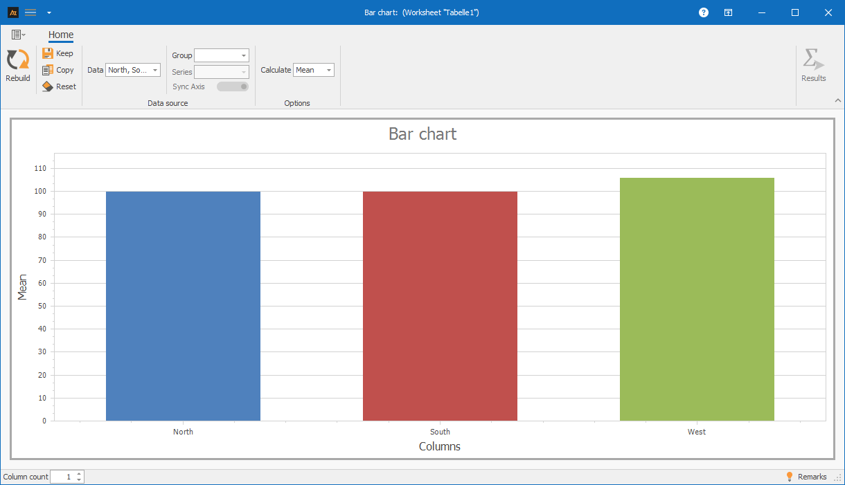
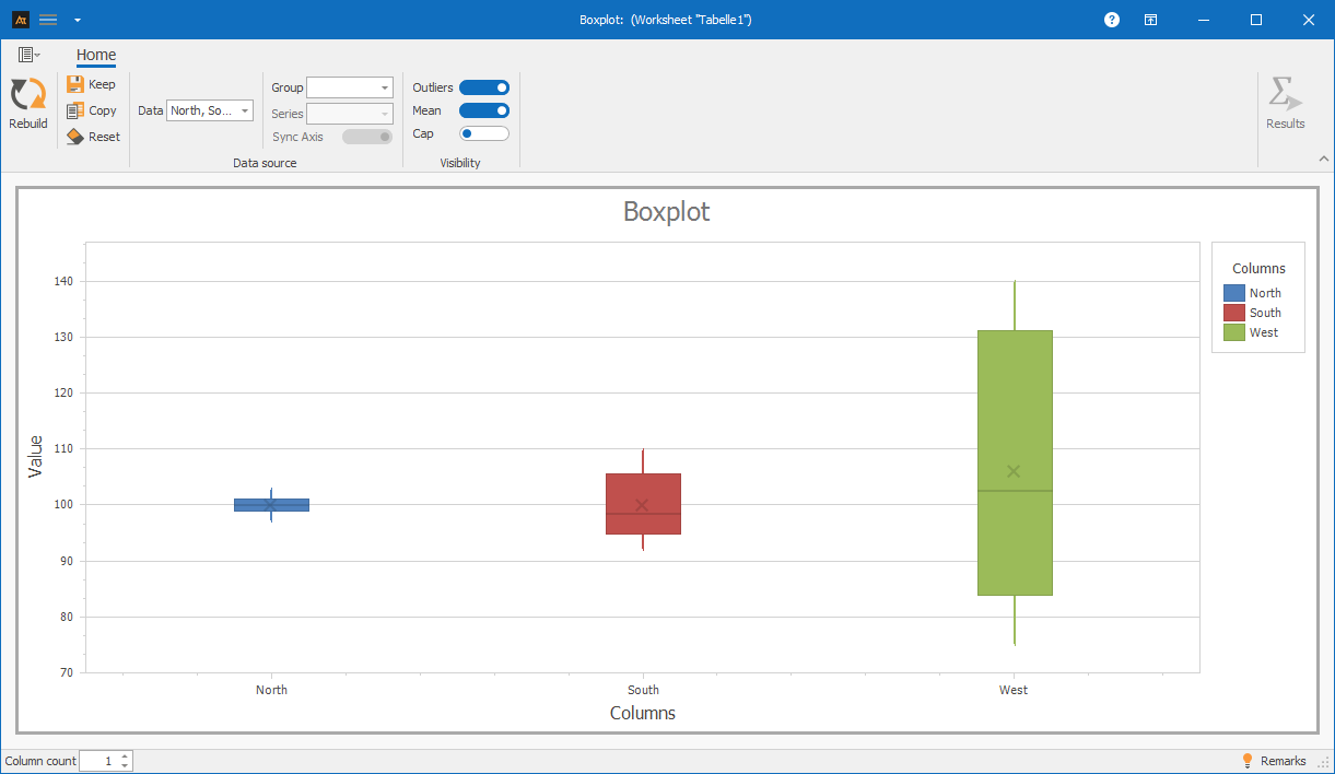
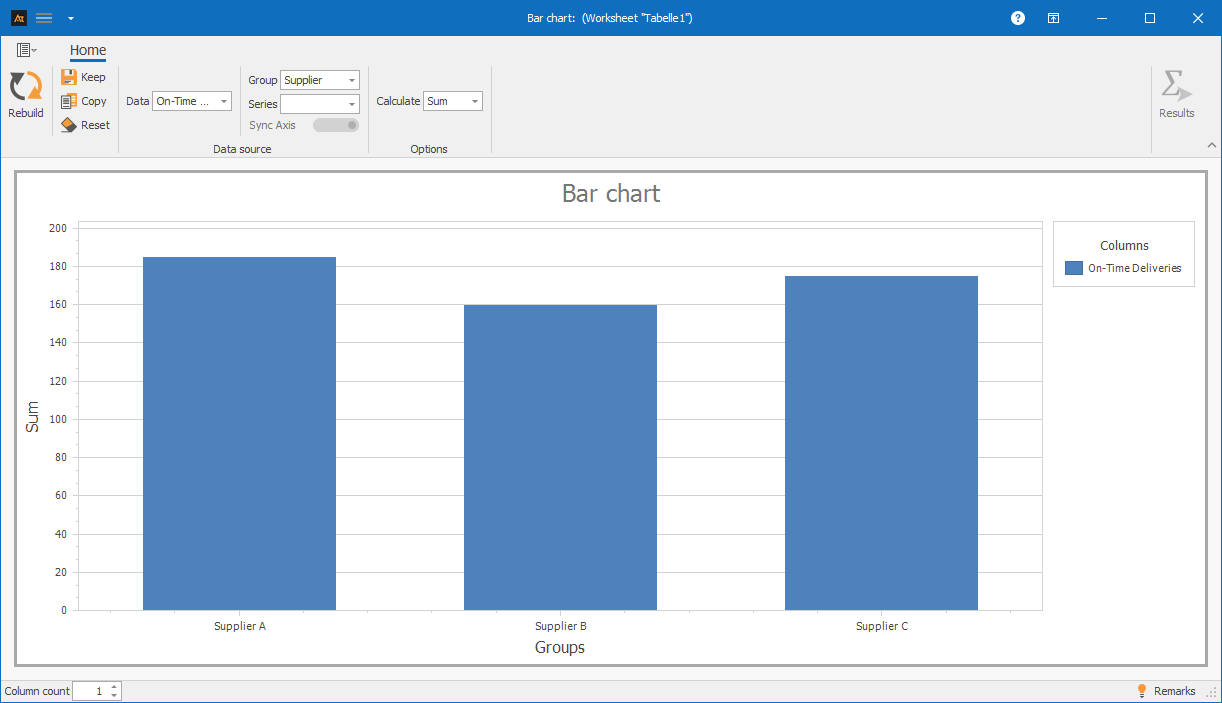
The bar chart shows the average number of deliveries for the north, south, and west locations.
The bar heights are at a comparable level for all three locations.
Based on the mean values shown, there are no significant differences in the average delivery volume between the locations.
The bar chart thus gives the impression of a similar average utilization of all locations. Differences in dispersion are not apparent in the bar chart. A box plot can compare both the location and the dispersion of different data sets.
Box plot comparison:

Purchasing
Supplier Comparison
Materials are purchased from several suppliers.
For each delivery, it is recorded whether it arrived on time.
In order to obtain an overview of the suppliers’ performance, the number of on-time deliveries per supplier is to be evaluated.
For this purpose, a bar chart is used to show the number of on-time deliveries per supplier.
The bar chart shows that Supplier A has the highest number of on-time deliveries.
Supplier B is significantly below this, while Supplier C achieves an average level.
This shows which suppliers make the greatest contribution to on-time delivery.
Planning
Forecast deviation
In production planning, a monthly production volume is specified for a production line.
At the end of each month, the actual quantity produced (actual quantity) is recorded.
A bar chart is used to show how planned and actual production volumes develop over the year in order to highlight any deviations between planning and implementation.
The bar chart shows the planned and actual production volumes from January to December.
Over the entire year, the actual production volume is slightly below the planned volume.
The deviations are relatively constant, with slightly larger differences at the beginning of the year and in the summer months.
This shows how the plan fulfillment develops over the year and that there are no individual months with exceptionally large deviations.
-
Terms
Group: Nominal characteristic that is displayed on the x-axis in the bar chart.
Data: Discrete or continuous variable that is displayed on the y-axis in the bar chart.
Bar: Graphical element whose height represents the value of the quantity displayed.
Series: Related values per category, e.g., planned and actual values or different groups.
-
formulas
Mean value
\( \bar{\mathrm{x}}=\frac{1}{\mathrm{n}}\sum_{i=1}^{\mathrm{n}}\mathrm{x}_i \)
Notation
n = sample size
xi = i-th measured value
-
Keywords