Purpose of the tool
Procedure
Settings
Interpretation guide
Forms of representation
Requirements
Tools
Examples
Terms
Formulas
Pie chart
-
Purpose of the tool
A pie chart is used to visually represent the proportions of a whole. It shows how a total value is distributed across different categories and answers the question of what proportion each category accounts for.
A pie chart is particularly suitable for:
- categorical characteristics (e.g., product variants, error types, locations)
- displaying percentage shares of the total value
- clear comparisons when only a few categories are shown and the sum forms a meaningful “whole”
-
Example tomato sauce:
The sales department tracks sales figures for various tomato sauce products.
The analysis focuses on the number of units sold for the following varieties:
- Classic Tomato Sauce
- Tomato Sauce with Herbs
- Spicy Tomato Sauce
A pie chart is used for the analysis, showing the share of total sales accounted for by each product variant.
The goal is to identify which tomato sauce variant accounts for the largest share of total sales.
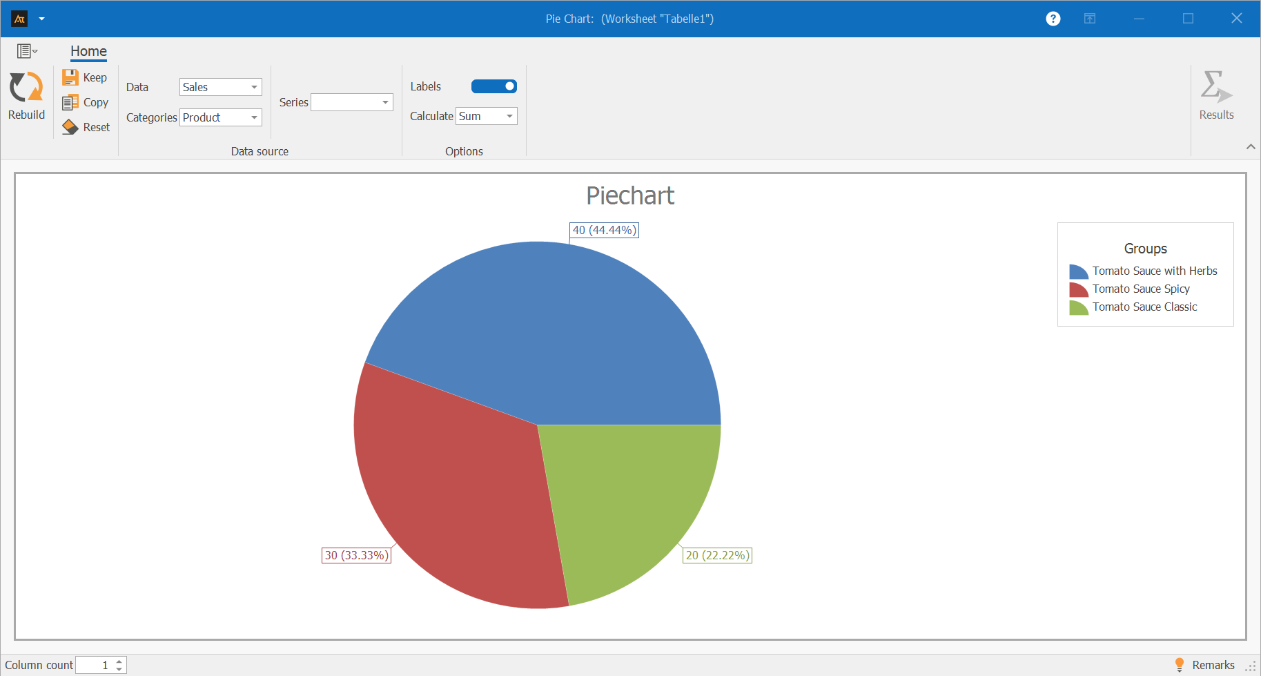
Explanations of the results:
The pie chart shows the distribution of sales figures across the three tomato sauce varieties: herb, spicy, and classic.
The herb tomato sauce accounts for the largest share of total sales at 44.44%.
The spicy variety accounts for 33.33%.
The classic tomato sauce has the smallest share of sales at 22.22%.
Explanations of the graph:
The pie chart thus clearly illustrates the relative contribution each product variant makes to total sales.
-
Procedure
(How was this graphic created?)
Preliminary Work
- Determine the categories whose shares are to be displayed
(e.g., classic tomato sauce, herb, spicy) - Collect the data (e.g., sales for each category)
 Use in AlphadiTab
- In the Measure phase, select the Pie Chart tool.
- Under Data, select the “Sales” column.
- For the category, select the “Product” column
- For the calculation method, select “Sum”
- Generate the chart using the “Create New” button.
Interpretation
- Comparison of the shares of the individual categories
- Identification of the category with the largest share of the total value
-
Interpretation Guide
- Which categories are shown?
- Which category has the largest share?
- Which category has the smallest share?
- How are the shares distributed overall?
-
Forms of presentation
Various display options are available for the pie chart. The chart’s appearance changes depending on whether one or more data series, as well as additional groups or series, are selected. Data can thus be visualized as individual bars, grouped, or broken down by series, and compared specifically with one another. All of the following display formats are based on the same file but differ in the selection of columns used. The procedure for each is described in the individual tiles.

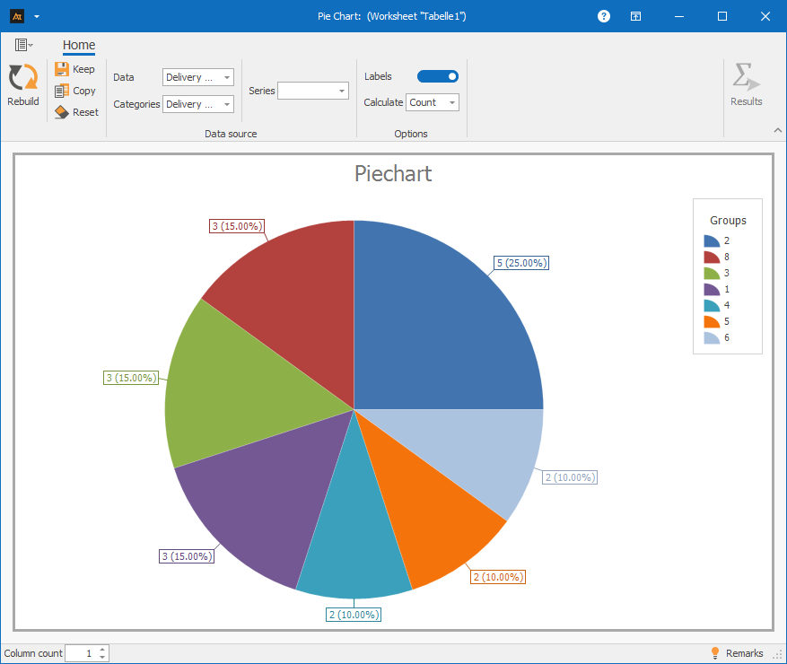
A data series: Column A only works if you specify the same column in the “Group” field
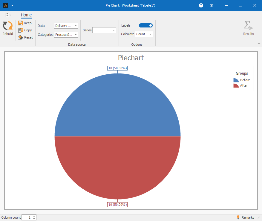
A data series and group: Column A and Column D
Procedure:
Step 1: For data, select only column A
Step 2: For categories, select column D (Process Status)
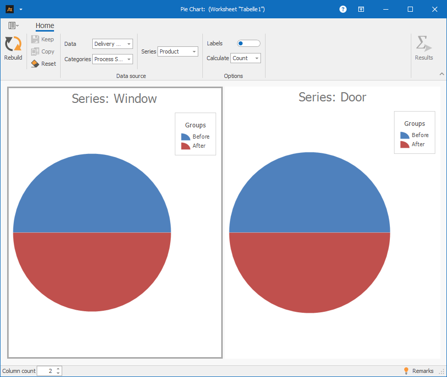
A dataset with group and series: Columns A, D, and E
Procedure:
Step 1: Under “Data,” select only column A
Step 2: Under “Group,” select column D (Process Status)
Step 3: Under “Series,” select column E (Product)
-
Requirements
- A grouping variable for sorting the data
-
Tools
(When are other options more suitable?)
- When comparing absolute values → bar chart
- When there is no clear overall value, but individual values are being compared → Bar chart
- When many categories need to be displayed and clarity suffers → Bar chart
- When distributions, variances, or trends over time need to be analyzed → Box plot, histogram, or time series chart
Development
Development of the old vs. new formula
A new recipe is being tested in the development phase.
As part of the data collection process, the frequency of use for both the old and new recipes is documented.
A pie chart is used to show the proportion of the total number of trials accounted for by the old and new recipes.
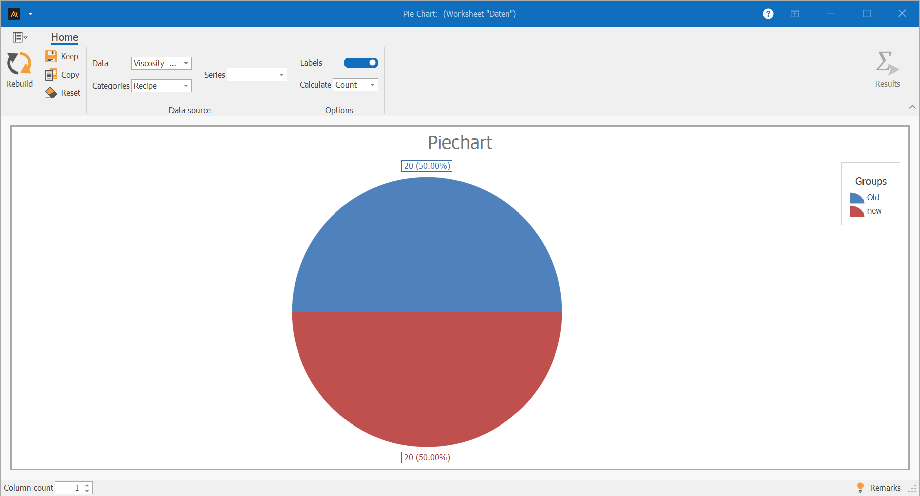
The pie chart shows the proportion of the old and new recipes in the total number of experiments conducted.
The old and new recipes were used with equal frequency.
Each recipe accounts for 50% of the total data collected.
The pie chart thus illustrates that the data set is evenly distributed between the two recipes.
Quality Assurance
Measuring the quality of test results
In quality assurance, the inspection results for the manufactured parts are recorded.
For each machine, it is documented whether an inspected part meets the quality requirements (pass) or does not meet them (fail).
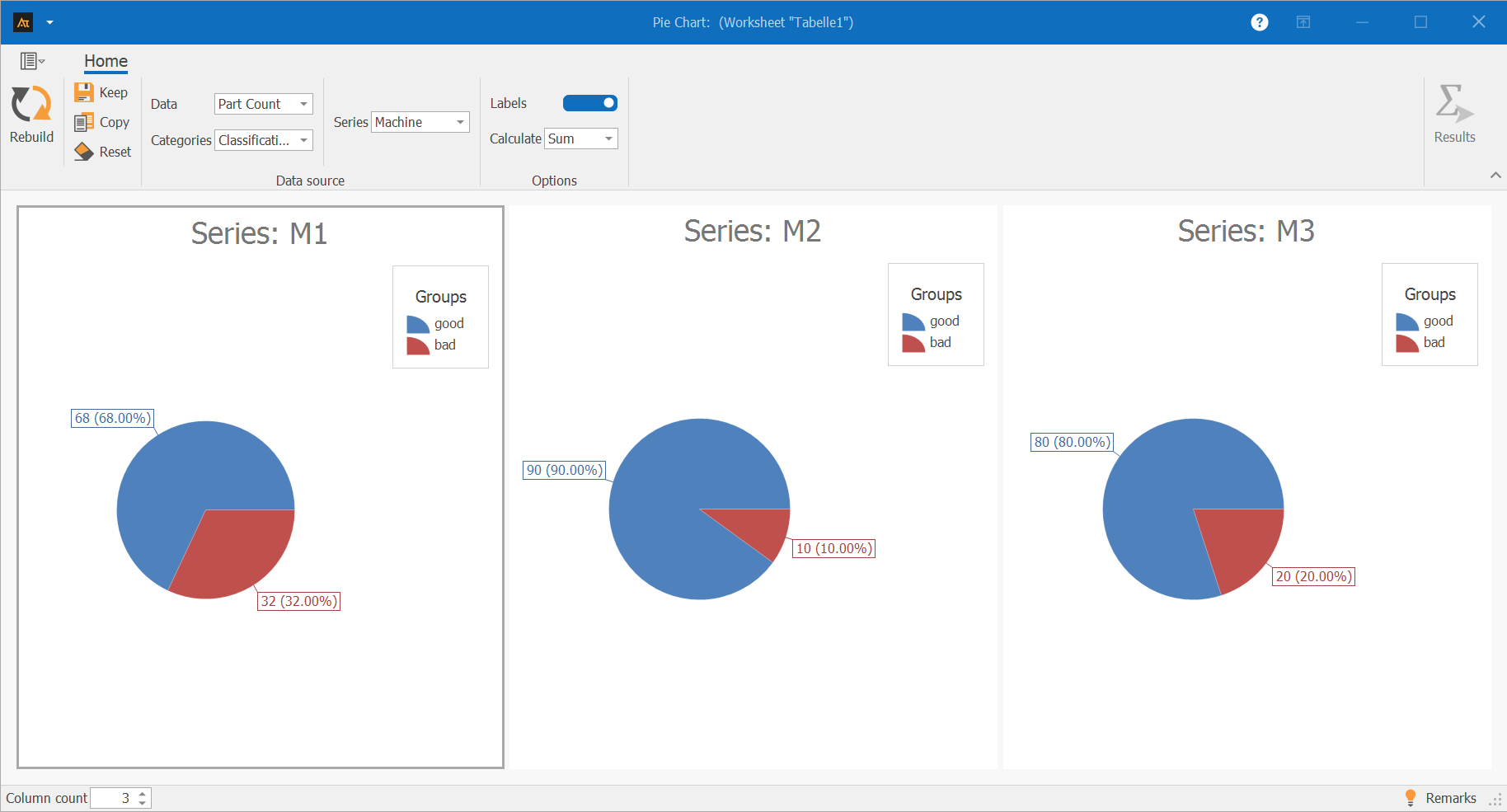
The pie charts show the percentage of good and defective parts out of the total number of parts inspected for machines M1, M2, and M3.
Machine M2 has the highest percentage of good parts at 90%, while the percentage of defective parts is correspondingly low.
Machine M3 has a percentage of good parts of 80%.
For machine M1, the percentage of defective parts is 32%, which is the highest compared to the other machines.
The pie charts thus illustrate how the inspection results are distributed between good and defective parts within each machine.
Production
Check the frequency of downtime
Machine downtime is systematically recorded during production.
For each machine, the frequency of downtime is documented. In addition, each machine is assigned to a specific production hall.
A pie chart is used to show the proportion of total downtime accounted for by each machine.
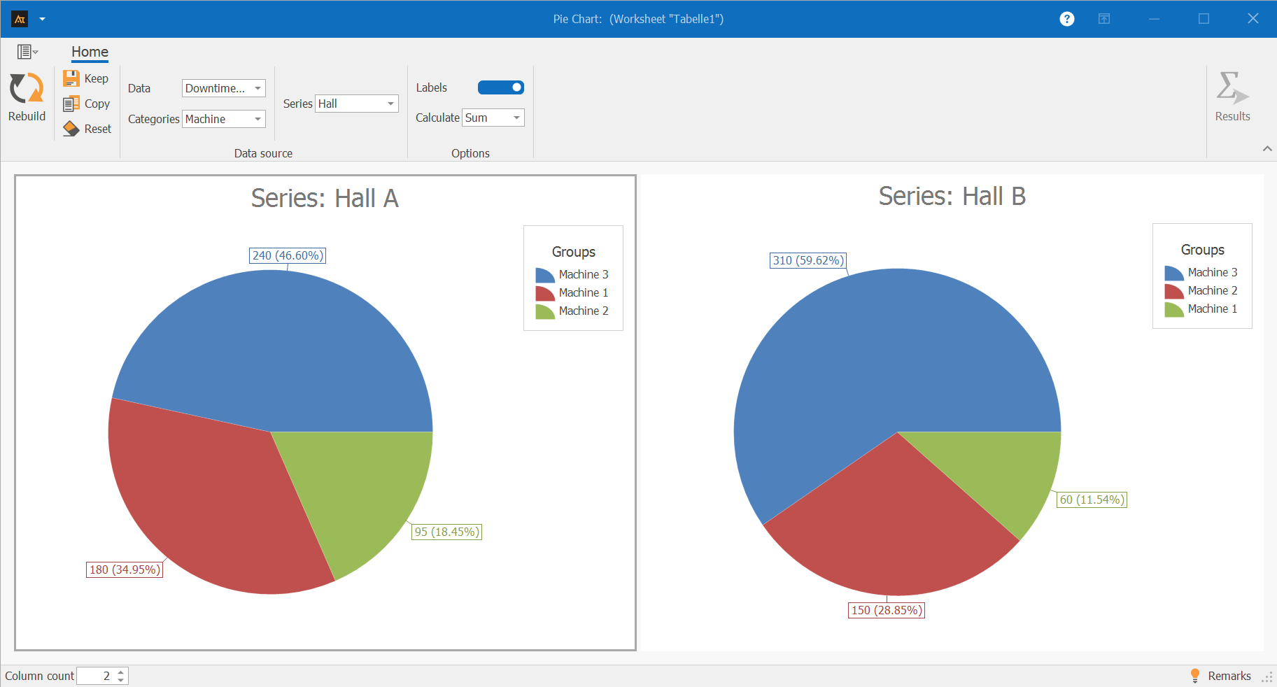
The pie charts show, for Halls A and B, the proportion of total downtime in each hall attributable to individual machines.
In Hall A, Machine 3 accounts for the largest share of downtime. Machine 1 and Machine 2 account for smaller shares of downtime.
In Hall B, Machine 3 is also responsible for the largest share of downtime. Machine 2 accounts for a moderate share, while Machine 1 has the smallest share of downtime.
Service
Percentage of IT tickets processed
The IT service desk handles requests from multiple locations.
To get an overview of the workload, the system tracks how many tickets were processed per location.
A pie chart is used to show the percentage of tickets processed by each location, highlighting differences in ticket volume.
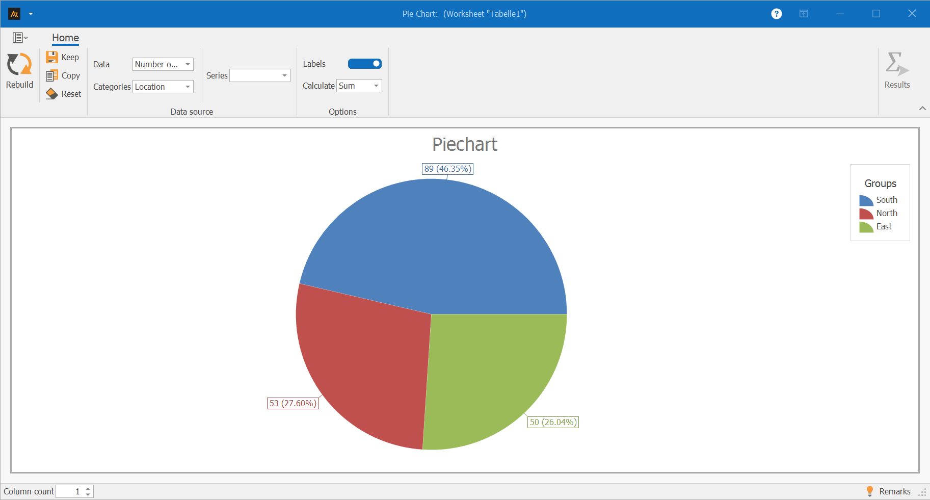
The pie chart shows the proportion of IT tickets processed at the South, North, and East locations relative to the total number of tickets.
The South location accounts for the largest share of processed tickets at 46.35%.
The North and East locations contribute roughly equal shares to the total volume, at 27.60% and 26.04%, respectively.
The pie chart thus illustrates how the total ticket volume is distributed across the individual locations.
Sales
Sales ratio by region
The sales department tracks sales for products A and B in the North, South, and West regions.
For each region, the company analyzes the share of the total sales volume accounted for by each product.
A pie chart is used to illustrate how sales are distributed between products A and B for each region.
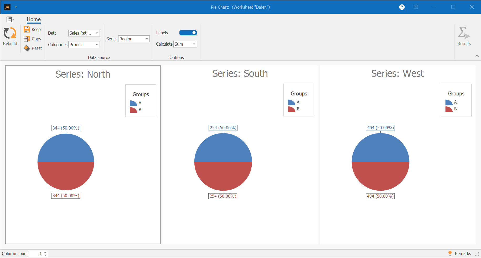
The pie charts show the share of products A and B in the total regional volume for the North, South, and West regions.
The distribution is identical in all three regions:
Product A and Product B each account for 50% of sales.
This shows that sales are not shifting in favor of either product in any of the regions under consideration.
Products A and B are equally represented across the regions.
Logistics
Deliveries to the logistics center
In logistics, customer orders are processed across multiple logistics centers.
To get an overview of how orders are distributed among the logistics centers, the system analyzes how many shipments have been processed by each logistics center.

The pie chart shows the shares of the West, North, and South logistics centers in the total number of processed deliveries.
The West logistics center accounts for the largest share of deliveries, at 34.64%.
The North and South logistics centers each contribute a similar share to the total delivery volume, at 32.68% each.
The pie chart thus illustrates how the total delivery volume is distributed among the individual logistics centers.
Purchasing
Supplier Comparison
The purchasing department sources materials from multiple suppliers.
For each delivery, a record is kept of whether it arrived on time.
For a defined period, the system analyzes the proportion of on-time deliveries attributable to each supplier.
The results are presented using a pie chart.
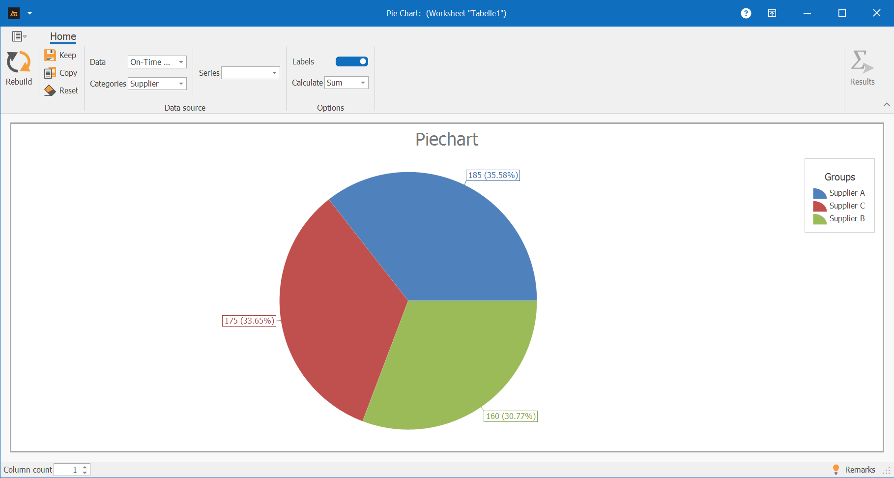
The pie chart shows the shares of suppliers A, B, and C in all on-time deliveries.
Supplier A accounts for the largest share of on-time deliveries at 35.58%. Supplier C follows with 33.65%, while Supplier B contributes the smallest share at 30.77%.
The pie chart thus illustrates how on-time deliveries are distributed among the individual suppliers.
Planning
Forecast deviation
Production planning takes into account the total amount actually produced in a given year.
The production volume is allocated to individual months.
A pie chart is used to show the share of each month in the total annual production.
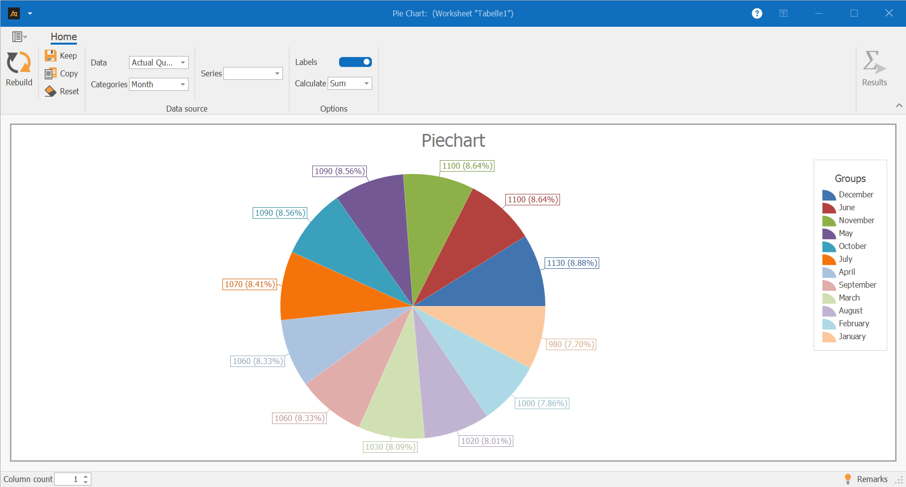
The pie chart shows the share of each month in the total annual production.
The monthly shares are roughly the same.
Certain months, such as December and June, account for slightly higher shares of annual production, while January accounts for a slightly lower share.
Overall, the pie chart illustrates that annual production is distributed relatively evenly across the months.
-
Terms
Pie chart: A chart used to represent the proportions of a whole.
Category: A subset of the total value, represented as a slice of the pie.
Proportion: The relative contribution of a category to the total value, usually expressed as a percentage.
Total value: The sum of all categories shown, to which the proportions refer.
Label: Display of the absolute values and/or percentage shares of the categories.
Count: Counts the number of data entries per category.
Sum: Adds the numerical data values per category.
-
Formulas
Formula for calculating percentages:
\( \mathrm{Share}(\%)=\frac{\mathrm{Value}\,\mathrm{of}\,\mathrm{Category}}{\sum \mathrm{all}\,\mathrm{Categories}}\cdot100 \)%
-
Keywords