Purpose of the tool
Procedure
Settings
Interpretation guide
Forms of representation
Requirements
Tools
Examples
Terms
Formulas
Time series chart
-
Purpose of the tool
A time series plot is used to display the trend of a measured variable over time. It allows one to assess whether the distribution and variability of the measured values remain constant over time or whether anomalies such as trends, shifts, patterns, or outliers occur. The time series plot is therefore a key tool for assessing process stability.
-
Example: Tomato Sauce
Viscosity measurements are routinely performed during the production of tomato sauce. The measured values are continuously recorded and plotted in chronological order.
The time series plot is used to determine whether the viscosity remains constant over time or whether any time-dependent anomalies occur.
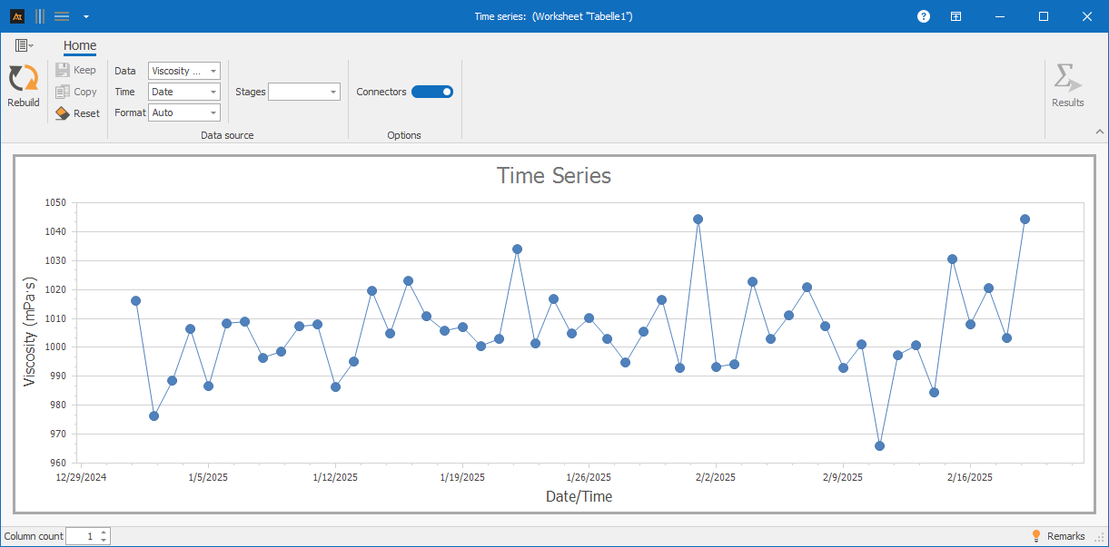
Explanation of the graph:
In a time series chart, each data point is displayed in the order in which it was recorded. The x-axis shows the time reference (e.g., measurement number or calendar week), and the y-axis shows the measured variable.
The time-based representation allows changes to be identified that are not visible in timeless charts.
-
Procedure
Preliminary Work
- Select a parameter that is measured regularly (e.g., viscosity).
- Define a unique time reference (e.g., measurement number or calendar week).
 Use in AlphadiTab
- In the Measure phase, select the Time Series tool.
- Under “Data,” select “Viscosity.”
- Under “Time,” select “Date.”
- Select “Auto” for Format.
- Generate the chart using the “Create New” button.
Interpretation
- Does the measured variable change uniformly over time?
- Are there any outliers?
- Is there a trend (rising or falling)?
- Is there a jump (shift) in the level of the measured values?
- Are regular patterns or periodic fluctuations visible?
-
Interpretation Guide
General Considerations
- Does the measured variable vary uniformly over time?
- Are there any outliers?
- Is there a trend (rising or falling)?
- Is there a sudden change (shift) in the level of the measured values?
- Are regular patterns or periodic fluctuations visible?
For known specifications
- Are all data points within the specifications?
- Is the mean value at the target value?
For multiple time series
- Are the time series aligned?
- Is the variance of the time series the same?
-
Forms of presentation
Various display options are available for time series charts. The chart’s appearance changes depending on whether one or more data series, as well as additional groups or series, are selected. Data can thus be visualized as individual time series or broken down into groups, allowing for targeted comparisons. All of the following display formats are based on the same file but differ in the selection of columns used. The procedure for each is described in the individual tiles.

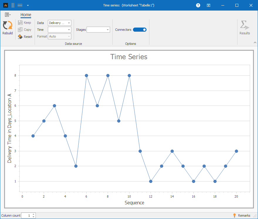
A data series: Column A
Procedure:
Step 1: Select only column A in the data
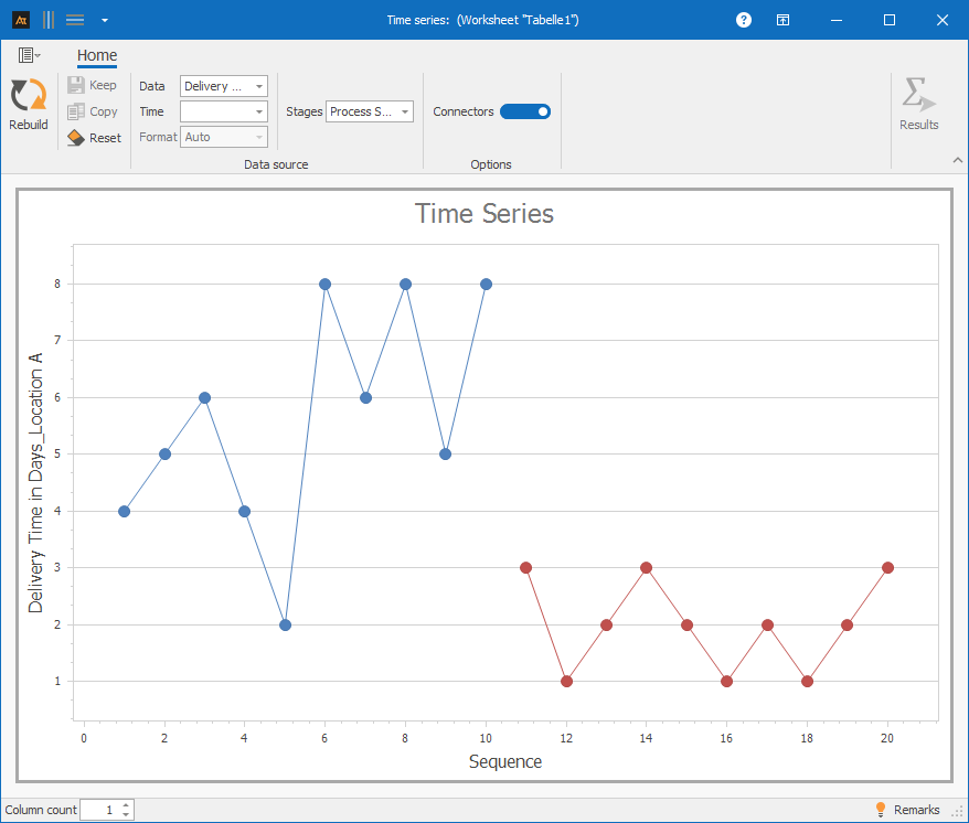
A data series and step values: Column A and Column D
Procedure:
Step 1: For data, select only column A
Step 2: For level values, select column D (Process Status)
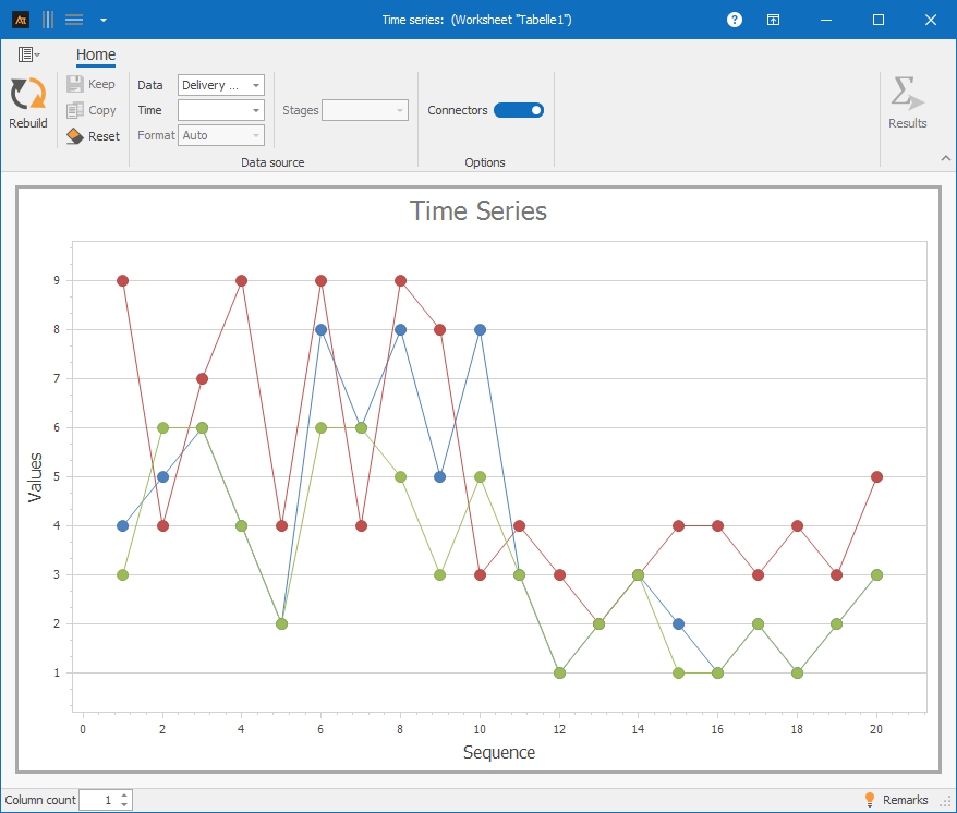
Multiple data sets: Columns A–C
Procedure:
Step 1: Select columns A–C in the data
-
Requirements
- Quantitative data (countable or measurable data)
- A suitable measuring instrument, since outliers can often result from measurement errors.
-
Tools
(When are other options more suitable?)
- When the data is nominal or ordinal.
- When the process needs to be evaluated for compliance with specifications: Process capability analysis
- If the distribution of the data is to be determined: histogram, identification of the distribution
- To identify patterns in the time series using the Nelson Rules: Control chart
-
Examples
Development
Development of the old vs. new formula
A new formulation is currently being tested in the development phase. The time-series plot will now be used to determine whether the viscosity of the new formulation behaves similarly over time to that of the previous formulation.
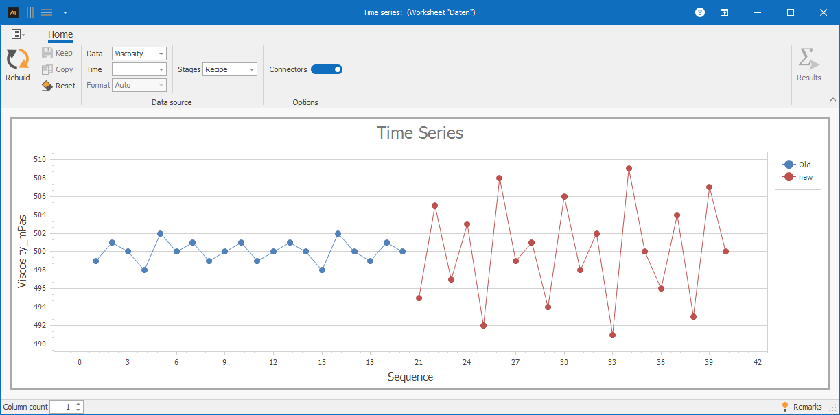
The time-series plot shows a steady trend in viscosity for the old formulation. For the new formulation, a greater variation in the measured values is evident, though the overall trend remains unchanged. No trend or sudden change is visible.
Production / Quality Assurance
Quality assurance found that some viscosity values were outside the expected range. The next step is to determine whether this issue occurs on all production lines or only on certain ones.
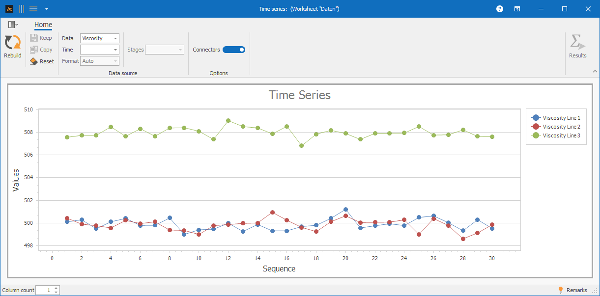
On a production line, a distinct jump in the measured values can be observed starting at a certain point in time. This indicates a systematic change in the process, such as a change in materials or a new setting.
Service
IT Ticket Processing Time: Before and After
Incoming requests are systematically recorded and processed at the IT Service Desk.
In particular, a before-and-after comparison should be conducted. The background is an organizational change: Responsibilities within the service process have been redefined.
Using a time series chart and the “Before/After” metric, this comparison can be conducted in a structured manner. This allows for a targeted analysis and evaluation of changes in lead times over time.
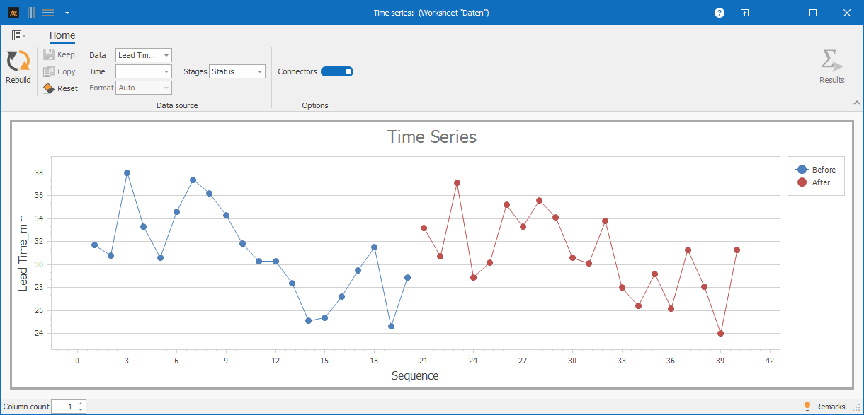
The time series chart shows individual outliers as well as periods with several consecutive high or low values. This indicates temporary special causes.
Sales
Sales figures by season
In sales, sales opportunities are analyzed by season. To this end, one data point was recorded per week for each season; additionally, the season was defined as a categorical variable. A time series chart will be used to analyze whether and how the sales rate has changed over time within each season.
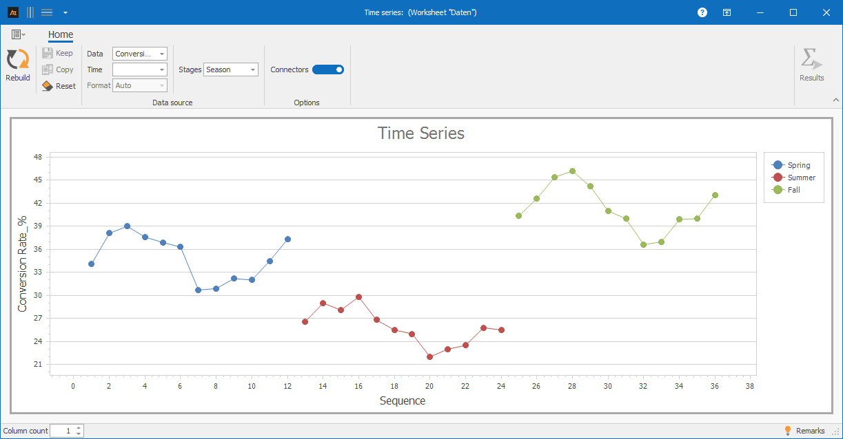
Over time, recurring fluctuations in the sales rate can be observed. These periodic patterns may be attributable to cyclical market influences. It is also evident that the sales rate is highest during the fall season and lowest during the summer season.
Logistics
Delivery time to the logistics center
In logistics, customer orders are processed across multiple distribution centers. Although the same processes and systems are used, delivery times may vary due to differences in workload, infrastructure, or regional conditions.
The time series chart is used to determine whether delivery times vary randomly over time.
The time series chart shows an overall upward trend in delivery times at all three locations. Two distinct peaks stand out, occurring simultaneously at all locations.
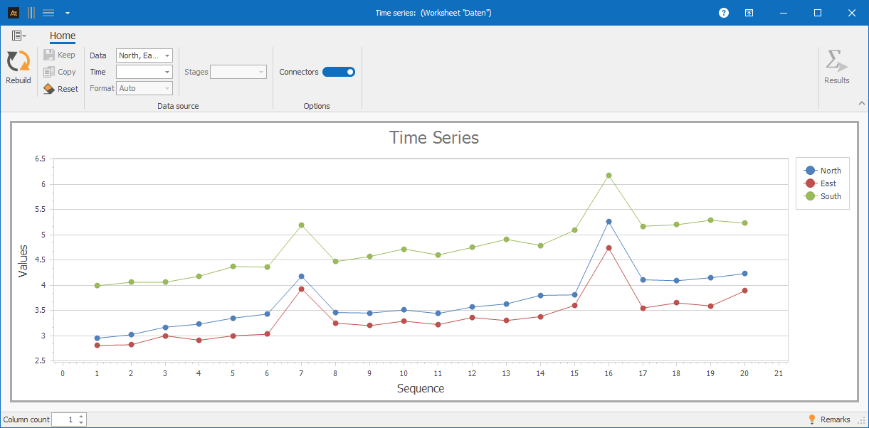
Purchasing
Supplier Comparison
The purchasing department sources materials from various suppliers. A time series chart will be used to examine whether the on-time delivery rate of different suppliers has changed over time. The on-time delivery rate [%] indicates how often deliveries arrive on time. A delivery is considered on time if it arrives within the agreed delivery window. On-time delivery is calculated as the percentage of on-time deliveries.
On-time delivery is calculated for each week:
( mathrm{On-time delivery}(%)=frac{mathrm{on-time},mathrm{deliveries}}{mathrm{total deliveries}}cdot100 )
For the time series chart, delivery reliability was calculated for several calendar weeks. Each data point corresponds to a supplier’s delivery reliability for a given week.
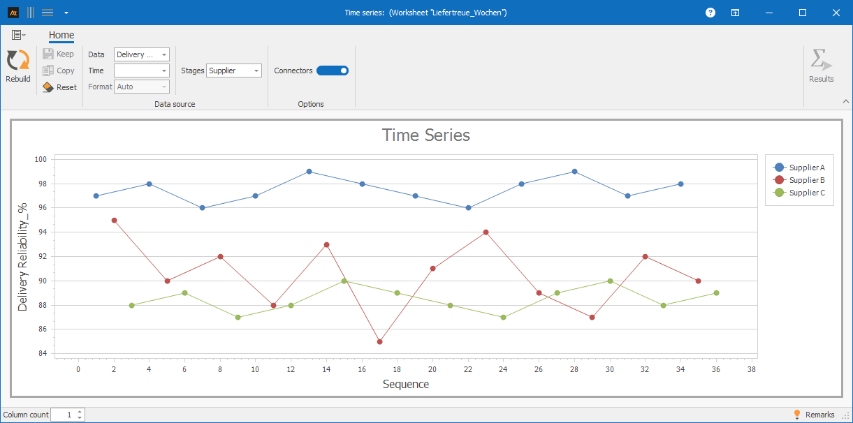
The time series chart shows significantly greater fluctuations in on-time delivery rates for one supplier, as well as individual weeks with very low figures. Other suppliers show a more consistent trend.
Planning
Forecast deviation
In production planning, demand forecasts are created. A time series chart is used to analyze whether forecast variances differ over time across various planning periods.
The forecast variance is calculated by comparing the planned demand with the actual demand. To present the variance in a comparable way, it is expressed as a percentage.
The calculation is as follows:
( mathrm{Forecast deviation}(%)=frac{mathrm{planned},mathrm{demand}-mathrm{actual},mathrm{demand}}{mathrm{actual},mathrm{demand}}cdot100 )
- A positive value means that the demand was overestimated.
- A negative value means that demand was underestimated.
- A value close to 0% indicates a very accurate forecast.
The percentage representation allows forecast variances to be compared independently of absolute quantities.
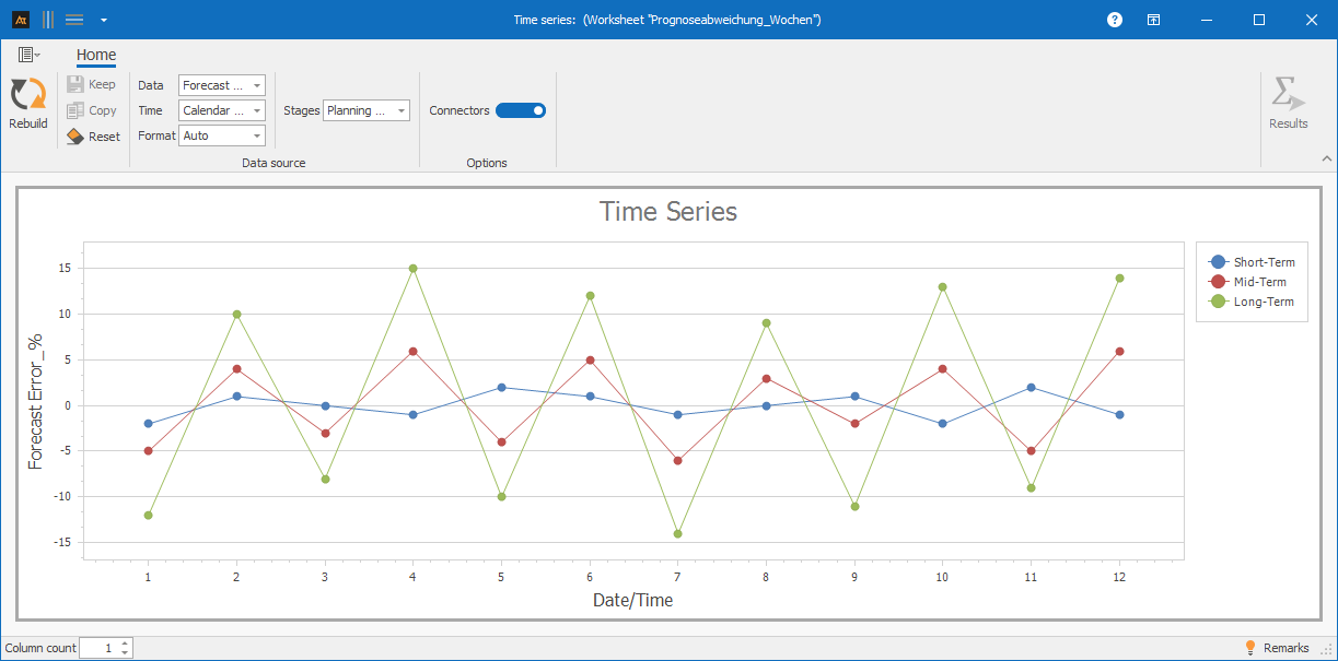
As the planning horizon increases, fluctuations in forecast errors rise significantly. In long-term planning, both positive and negative outliers occur, indicating a higher degree of uncertainty.
-
Terms
Time series: A sequence of measured values with a temporal reference
Outlier: An individual measured value that deviates significantly from the rest of the trend
Trend: A long-term increase or decrease in measured values
Shift: A sudden and permanent change in the level
Stable process: A constant level and dispersion over time
-
Keywords